


Brand Identity | Logo Design | Packaging
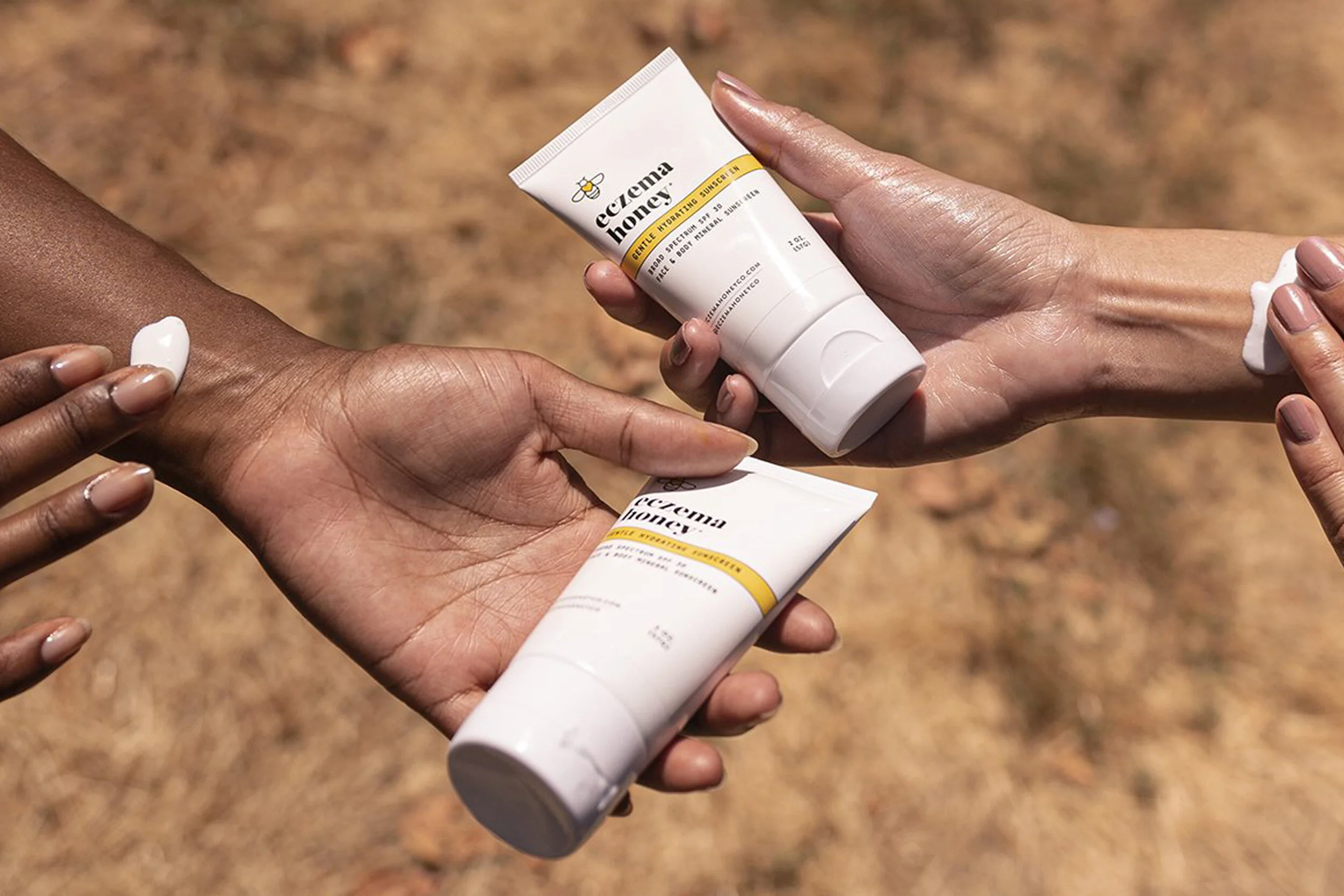
The client approached us with a straightforward goal: to take their existing brand design to the next level. We decided to keep their iconic yellow color and positioned the yellow heart at the center of the new bee symbol, giving the overall branding a visual uplift. After implementing our redesign, Eczema Honey saw a substantial increase in growth and brand visibility.